Letting computers do the hard work

As iOS developers we’re still used to doing many manual tasks. It’s an issue that exists because everything is still new. Just ask your back-end developer about the last time they manually deployed a new version directly to the production server. The answer should be: Oh, I was still in high school back then. Why? Because there are many mechanisms before the actual release to avoid broken releases that don’t pass the tests.
Using fastlane you can already automate a large part of your daily development tasks, but one thing was missing:
Have you ever been to an airport, where you had to ask the manager of the airport if you can board now? Once the manager agrees, you’ll be carried from your check-in to your gate into your plane.
Because that’s what you are doing right now as an app developer when you want to invite a beta tester to your TestFlight app. And you even repeat that for every single beta tester you invite.
Right now, you have to go through 9 steps (on the right) just to invite one beta tester to your TestFlight program.
Have you ever asked a blog publisher if they add you to their newsletter? No, that’s not how that works!
I just launched boarding, a tool that allows you to launch your own TestFlight Invite page in under 3 minutes.
More information about this project can be found on GitHub.
About Automation
If you’re reading this post, chances are high you are an iOS/Mac developer. You get paid for developing iOS applications which is probably what you’re best in.
Are you responsible for…?
- Creating and uploading screenshots
- Updating app metadata like the description
- Manually building and uploading a beta build when your boss tells you to
- Inviting new beta testers to your beta testing service
You probably said yes to some of those points. In my experience most developers do those things manually. Why?
We haven’t got time to automate this stuff, because we’re too busy dealing with the problems caused by our lack of automation. - @bitfield
While some developer may enjoy doing passive activities, you usually want to get your job done. That means working on the iOS/Mac app itself working on awesome new features.
That’s why we have to follow our friends from the back-end team and start automating tedious processes. Instead of us, computer should do those tasks.
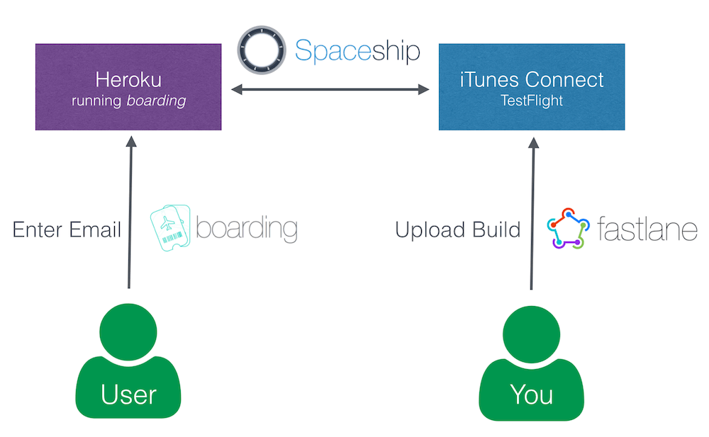
As you can see, the users interested in beta testing your application accesses your Heroku application directly to enter their email address. The Heroku app will then use spaceship to communicate with iTunes Connect directly without any interaction from a real person. Spaceship automatically registers the new testers, adds them to the application and sends out the TestFlight email.
You as an developer are in no way involved in this process. Once you merge into your beta branch, fastlane will go ahead and build, sign and upload your app, resulting in automatic emails to all your testers. (this depends on how you use fastlane)
If you tried the Heroku button, you’ll see there are no additional manual steps required to get a web service running. You enter your credentials, choose your application and the web service is up and running.
What’s next?
The primary use case of boarding was not to actually solve this certain problem, but to demonstrate what’s possible using spaceship. In only 24 hours I had the idea for boarding, started working on it and released it publicly.
Think about what you can build with spaceship. It’s a foundational tool to communicate with Apple’s web services, both the Apple Developer Portal and iTunes Connect allowing you to build all kinds of cool things!
Some random ideas:
- Automatically sync iTunes Connect users with your company internal user system
- Automatic daily backups of all iTunes Connect and Apple Dev Portal data
- Automatically send customers emails once a new version of their app got approved
- Build a lightweight dashboard for your clients to see a grid of their apps with the current download numbers, reviews and app review status
- Using the same change-log text for all languages? Why should you copy&paste the text manually to 10 languages?
- Added App Review information to your company dashboard or push them directly to Slack
Tags: testflight, automation, spaceship, boarding | Edit on GitHub
pilot - Manage your TestFlight builds and testers
Using pilot, you can now manage your TestFlight builds and testers using the command line.
- Upload new builds and distribute them to all testers
- List all available builds
- Add and remove beta testers
- Get information about testers, like the registered devices
- Export and import all your testers
Open on GitHub
boarding - The easiest way to invite your TestFlight beta testers
Have you ever been to an airport, where you had to ask the manager of the airport if you can board now? Once the manager agrees, you’ll be carried from your check-in to your gate into your plane.
Because that’s what you do right now as an app developer when you want to add a new tester to your TestFlight app
Why don’t you have a simple web site you can share with potential testers (e.g. email newsletter, Facebook, Twitter) on which people interested in trying out your new app can just board on their own?
Open on GitHub
Tags: testflight, spaceship | Edit on GitHub
Managing fastlane feedback
I’m happy to say, most feedback I receive for the fastlane projects is very positive. I think that’s mostly because it’s something that’s completely new in the iOS field and people just realised: Hey, we can actually automate those kind of things.
Sometimes we forget the happiest moments. Remember the time your role model tweeted about you or one of your projects? Remember the time a well known developer retweeted your last tweet? It’s the best thing, you are insanely happy for a while, but forget about it again a few days later.
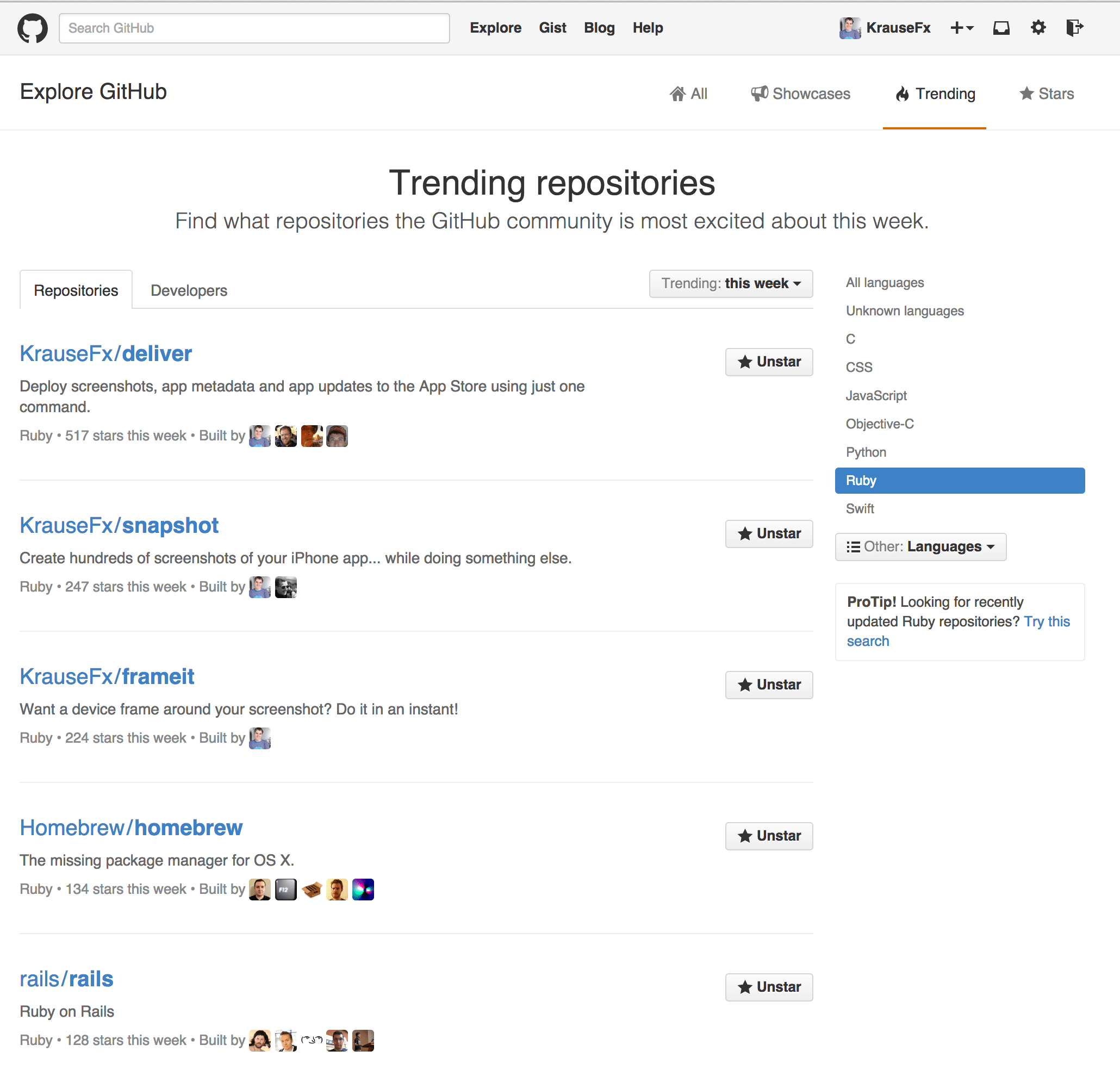
But that doesn’t only apply to tweets: How about the last time one of your projects became a trending repository on GitHub? What about that email you received from a fan who just wanted to say Thanks?
It might be just be me, but I don’t want to lose that “moments”. I even collected screenshots of the “follow” notifications I received when some of my favourite developers like @orta, @tapbot_paul , @ashfurrow, @javi, @soffes and @kylefuller started following me on Twitter.
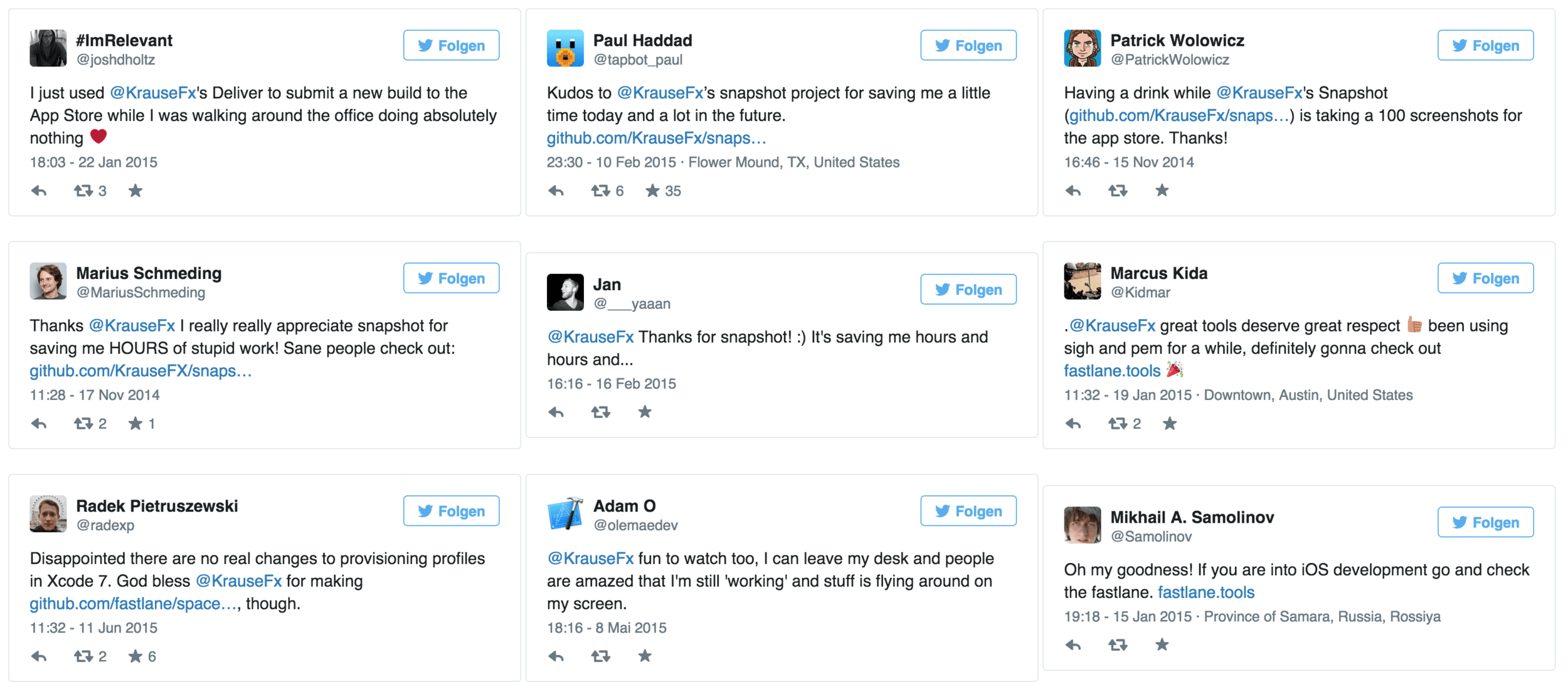
I just didn’t want to lose all this. That’s why I collected the best tweets and screenshots since the initial launch of deliver.
Open All Tweets
Screenshots
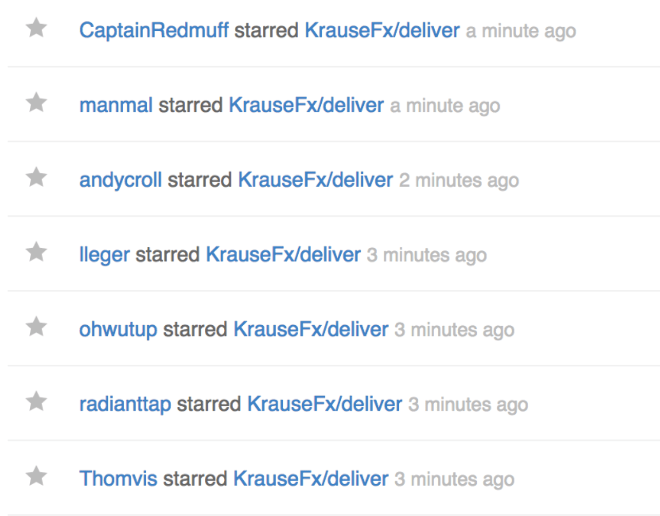
Besides tweets, you probably want to remember all kinds of things: comments on Reddit, the number of visitors you had on launch day and smaller things like the number of git commits you had on that one day.
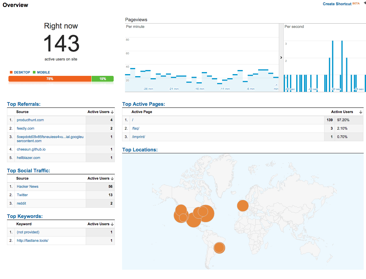
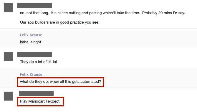

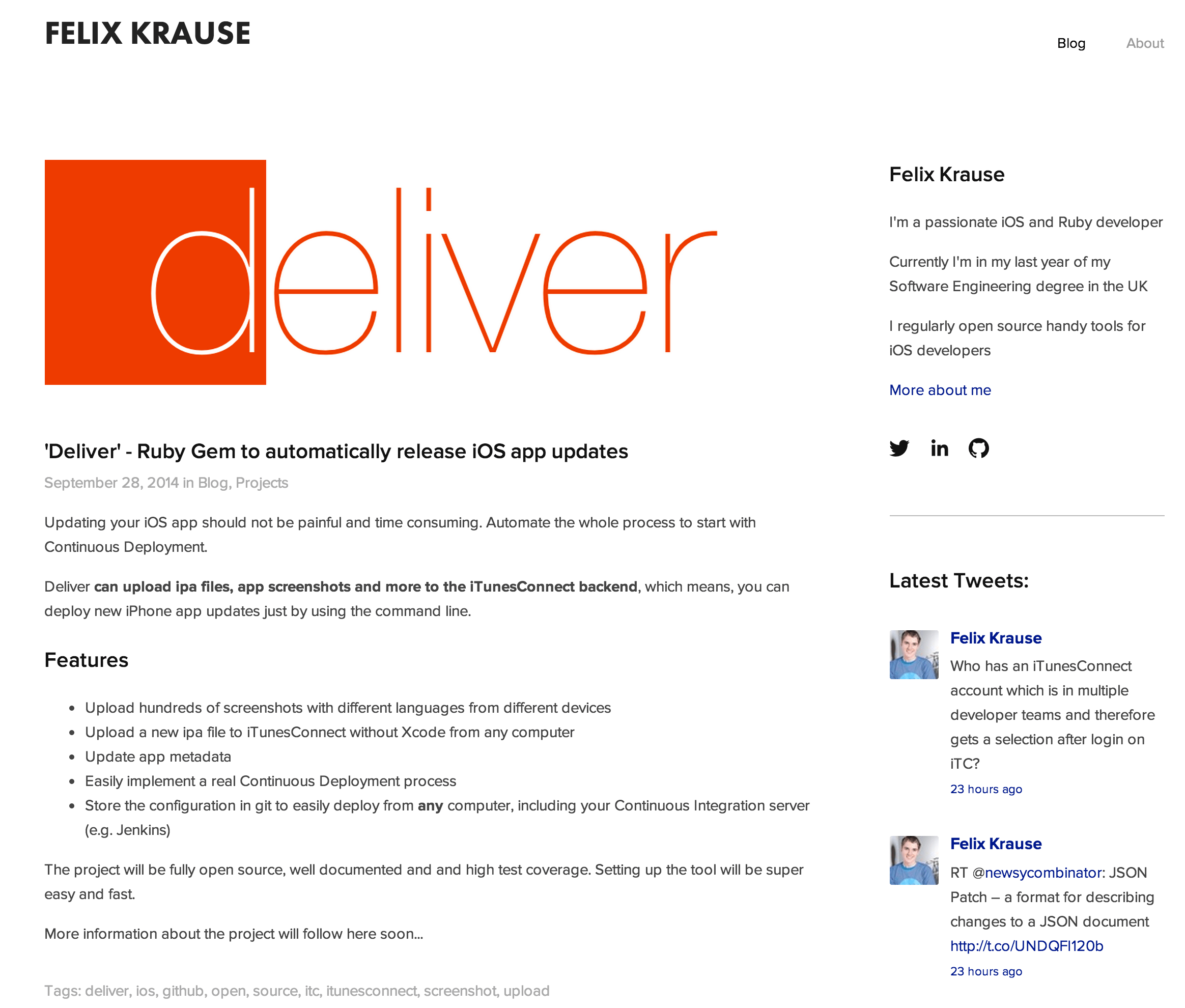
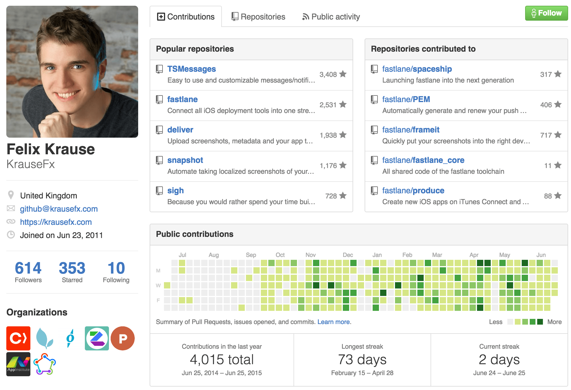
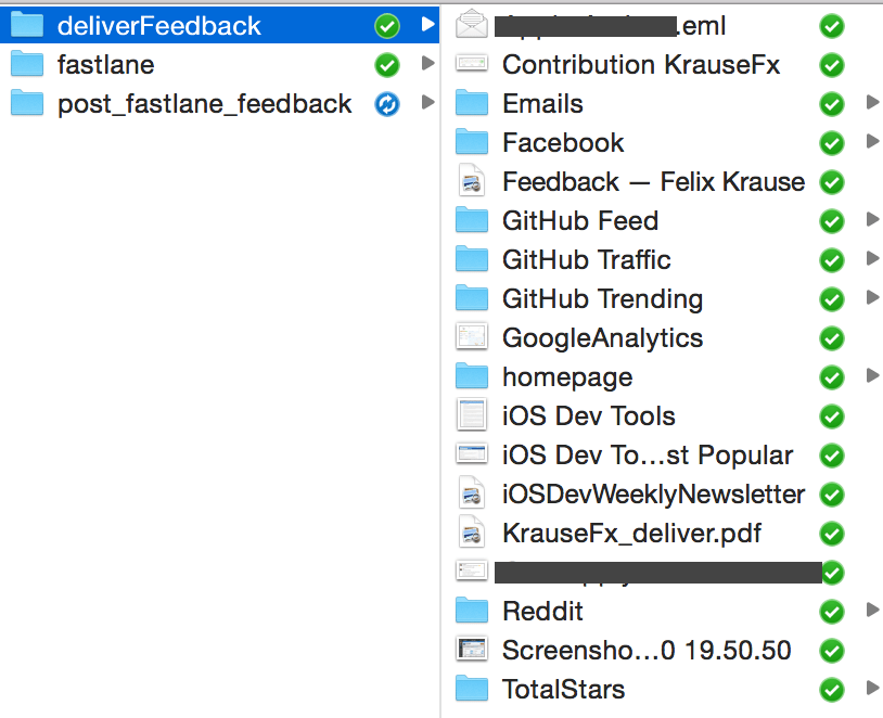
Emails
I’m still using Sparrow, the best mail client for the Mac. To store an email, I just drag and drop the email into the fastlane feedback folder.
And now what?
So why do all this? I’m not a super organised person, but I try my best to do this right. After storing all this, I usually print it all and store it somewhere save. All this just because you never know what formats will be readable in 20 years and if you “lose” some files because you forgot to migrate some of those files.

